
If you’ve been test-driving the iOS 26 beta and found yourself second-guessing every swipe in the Camera app, you’re not alone. What was once a muscle memory action—left for Video, right for Portrait—suddenly felt… wrong. Apple’s sleek new Liquid Glass UI and simplified layout in iOS 26 were designed to make the Camera app more intuitive, but for many long-time iPhone users, the new swipe direction for switching camera modes did the opposite. The good news? In iOS 26 beta 5, Apple listened—and gave us back control.
What Changed in iOS 26’s Camera App
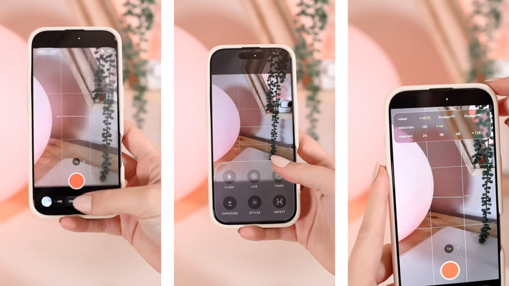
Apple teased the Camera app redesign long before WWDC 2025, and when iOS 26 was officially introduced, the interface overhaul became real. The app now looks cleaner, sleeker, and yes, a little more futuristic thanks to the new Liquid Glass design language spreading across the OS. Functionally, it’s supposed to be more user-friendly—fewer options up front, more focus on getting the shot.
But alongside this simplified UI came one quietly frustrating change: the swipe gesture for changing camera modes was reversed. Historically, swiping left would move the mode selector to the right—an oddity that just worked. Now, with iOS 26, Apple made it feel more literal: swipe right, go right. On paper, that sounds logical. But for many users, especially those who’ve been swiping the old way for years, the change was more than just awkward—it was disorienting.

Classic Mode Switching Is Back—and Optional
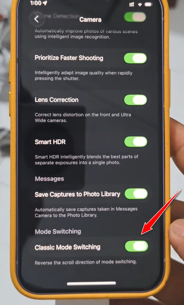
Starting in iOS 26 beta 5, Apple has added a new toggle in Settings called “Classic Mode Switching.” Flip it on, and your Camera app will return to its pre-iOS 26 behavior—left swipe goes right, right swipe goes left.
To turn it on:
Settings → Camera → Classic Mode Switching → Toggle On
That’s it. No complicated steps, no hidden menus. The feature is off by default, so if you’ve gotten used to the new behavior or you’re a new user who finds the revised gesture more natural, you don’t have to touch a thing. But for everyone else—especially those upgrading from iOS 18 straight to iOS 26 this fall—this tiny setting might feel like a lifesaver.
Why This Matters (More Than You Think)
Some might call this a minor tweak, but it’s emblematic of how users form habits around UI decisions—especially on devices we use constantly. Much like the scrolling debate on macOS (“natural” vs. classic), this swipe change taps into that tension between progress and preference. Apple’s decision to offer both options isn’t just a win for usability—it’s a rare moment of flexibility in a company known for forcing change.
And let’s face it: photography is muscle memory. You don’t want to miss a shot because your brain is still rewiring its swipe instincts. This toggle is about more than nostalgia—it’s about performance.
Closing Thoughts
iOS 26 may be full of futuristic visuals and smarter systems, but it’s the little things—like this swipe toggle—that remind us Apple is still paying attention to how people feel when they use their devices. Personally, I love the new UI polish, but I’ve already switched back to Classic Mode Switching. There’s something comforting about familiarity—especially when it’s only one swipe away.
If you’re jumping into iOS 26 for the first time later this year, keep this tweak in mind. It might just be the feature you didn’t know you needed—until your thumb tells you otherwise.


'%3e%3cg id='Final-Copy-2_2_' transform='translate(1275.000000, 200.000000)'%3e%3cpath class='st0' d='M7.4,12.8h6.8l3.1-11.6H7.4C4.2,1.2,1.6,3.8,1.6,7S4.2,12.8,7.4,12.8z'/%3e%3c/g%3e%3c/g%3e%3c/g%3e%3cg id='final---dec.11-2020'%3e%3cg id='_x30_208-our-toggle' transform='translate(-1275.000000, -200.000000)'%3e%3cg id='Final-Copy-2' transform='translate(1275.000000, 200.000000)'%3e%3cpath class='st1' d='M22.6,0H7.4c-3.9,0-7,3.1-7,7s3.1,7,7,7h15.2c3.9,0,7-3.1,7-7S26.4,0,22.6,0z M1.6,7c0-3.2,2.6-5.8,5.8-5.8 h9.9l-3.1,11.6H7.4C4.2,12.8,1.6,10.2,1.6,7z'/%3e%3cpath id='x' class='st2' d='M24.6,4c0.2,0.2,0.2,0.6,0,0.8l0,0L22.5,7l2.2,2.2c0.2,0.2,0.2,0.6,0,0.8c-0.2,0.2-0.6,0.2-0.8,0 l0,0l-2.2-2.2L19.5,10c-0.2,0.2-0.6,0.2-0.8,0c-0.2-0.2-0.2-0.6,0-0.8l0,0L20.8,7l-2.2-2.2c-0.2-0.2-0.2-0.6,0-0.8 c0.2-0.2,0.6-0.2,0.8,0l0,0l2.2,2.2L23.8,4C24,3.8,24.4,3.8,24.6,4z'/%3e%3cpath id='y' class='st3' d='M12.7,4.1c0.2,0.2,0.3,0.6,0.1,0.8l0,0L8.6,9.8C8.5,9.9,8.4,10,8.3,10c-0.2,0.1-0.5,0.1-0.7-0.1l0,0 L5.4,7.7c-0.2-0.2-0.2-0.6,0-0.8c0.2-0.2,0.6-0.2,0.8,0l0,0L8,8.6l3.8-4.5C12,3.9,12.4,3.9,12.7,4.1z'/%3e%3c/g%3e%3c/g%3e%3c/g%3e%3c/g%3e%3c/svg%3e)

0 comments